Charts and Tables
This section overviews the most commonly used table and chart types available on the Charts ribbon. For additional details on what is available in Output Viewer, see Output Viewer Help Guide.
Summary
Summary tables and charts give a basic summary of useful information for your Locations, Entities, Resources, and Variables. Summary tables display a collection of numbers to convey information, while summary charts use bar graphs to visually display a single piece of information. Use the Output Viewer Filter to change what information displays in a summary table or chart.

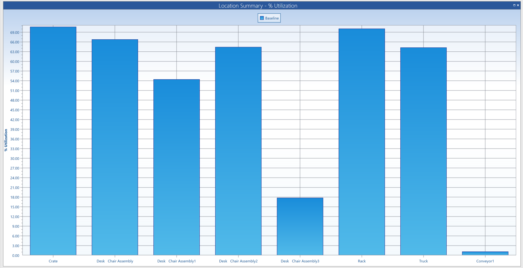
Utilization
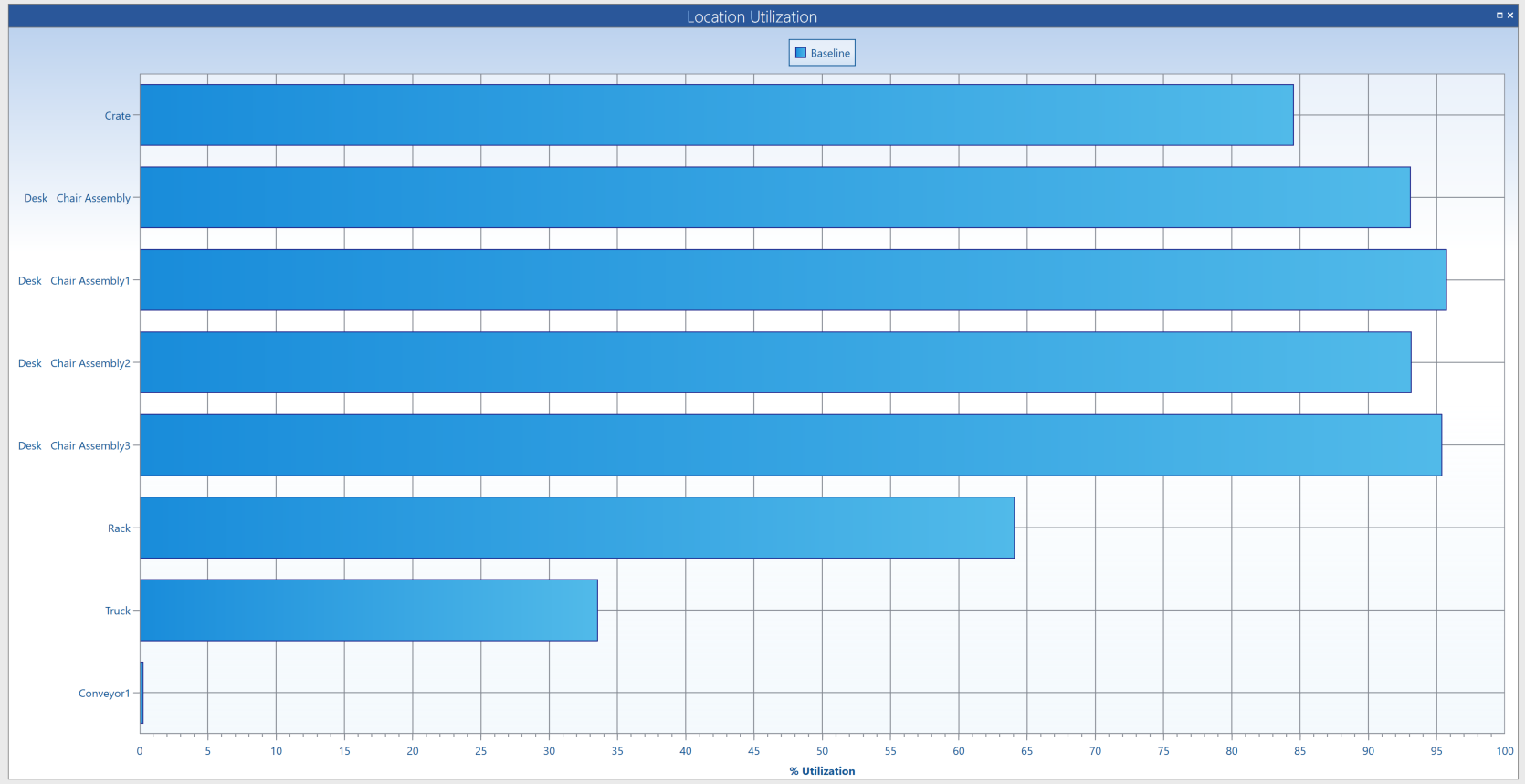
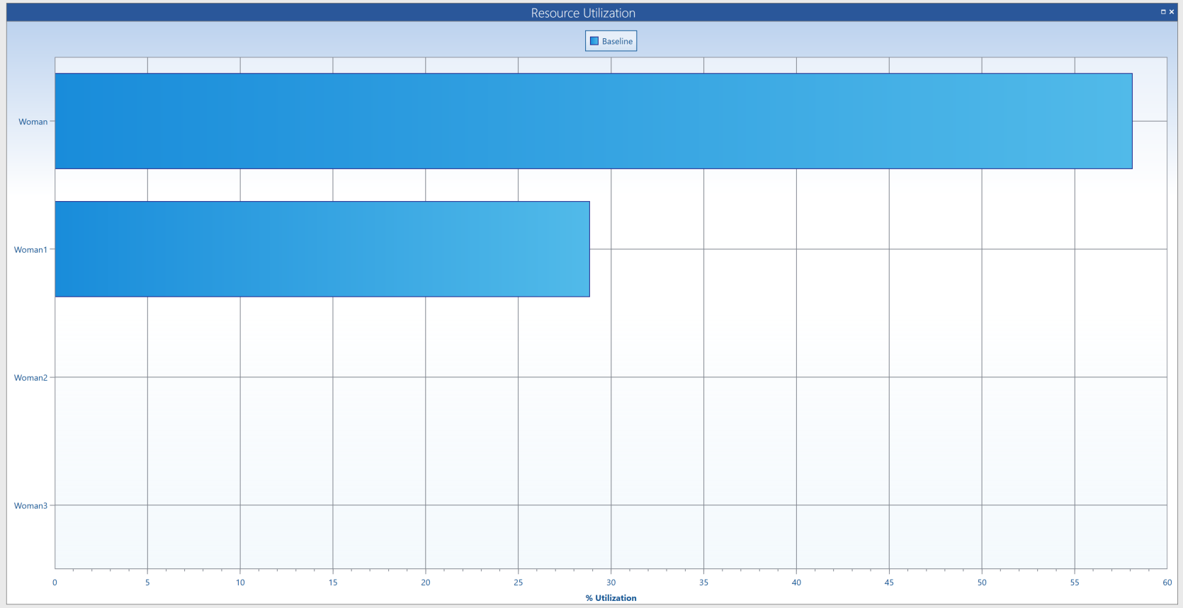
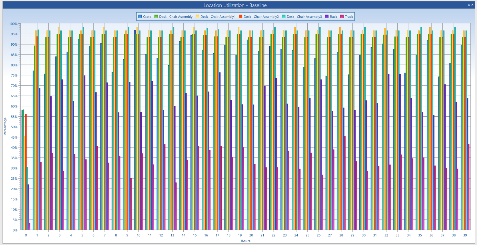
Utilization charts demonstrate in a percentage how much a particular Location or Resource is utilized during a simulation. More specifically, the Location Utilization chart shows the percentage of the overall scheduled time that a location capacity is utilized during the simulation. The Resource utilization chart shows the percentage of time each resource is used during the simulation. Use the Output Viewer Filter to change which items are included in a Location or Resource utilization chart.
State
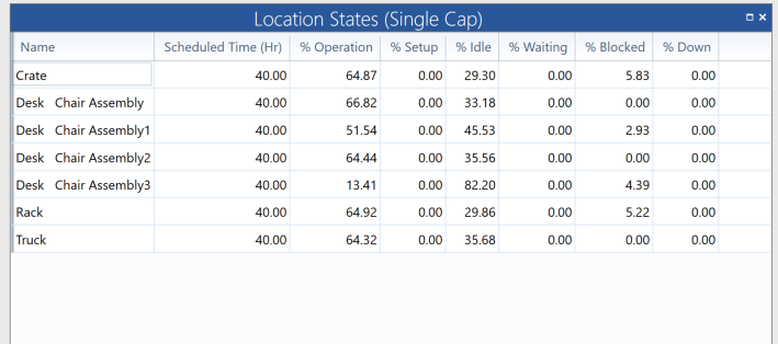
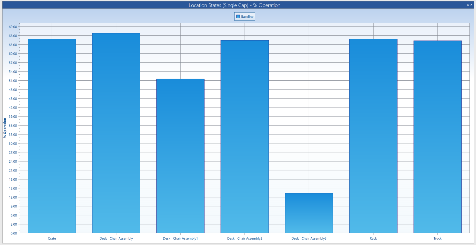
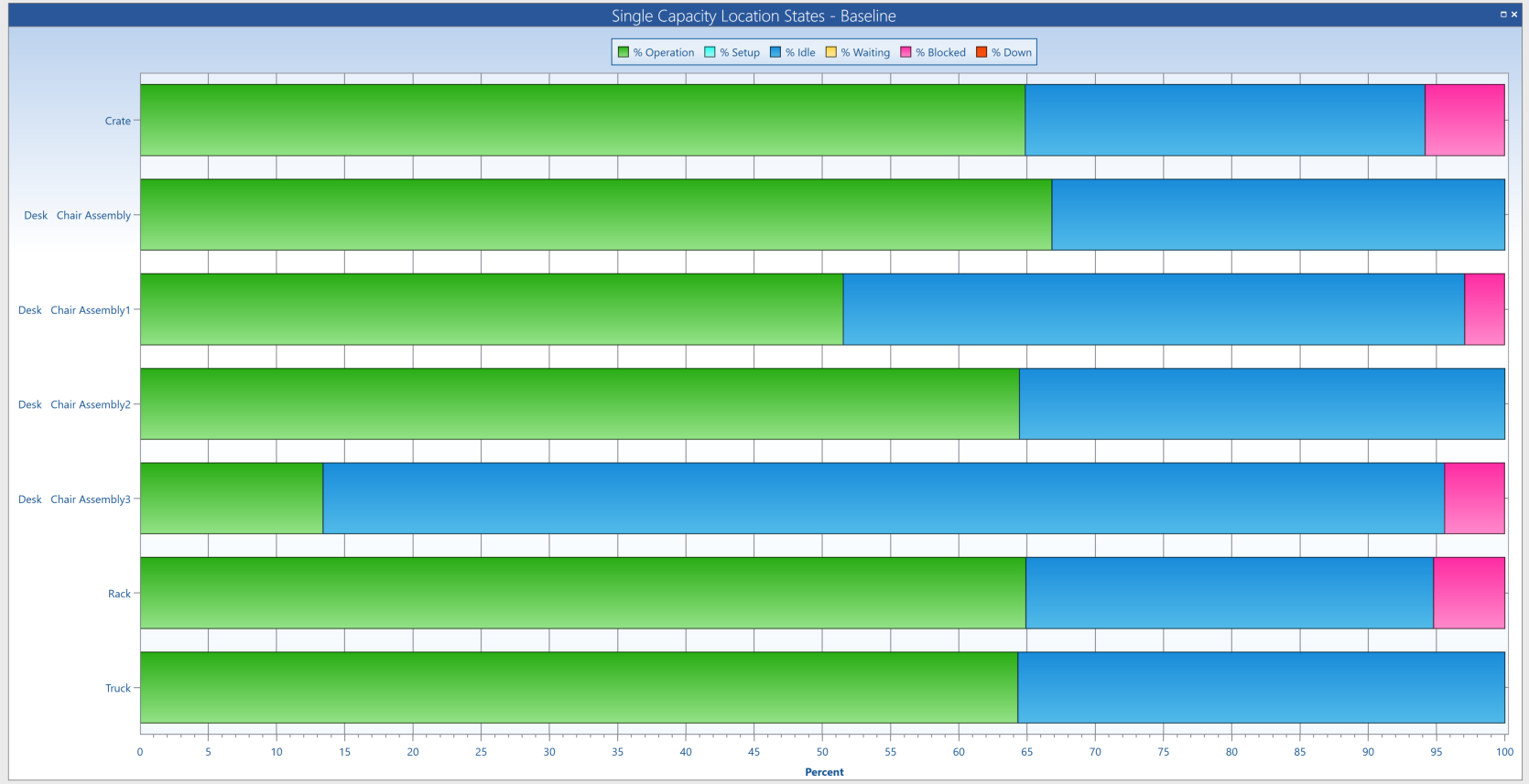
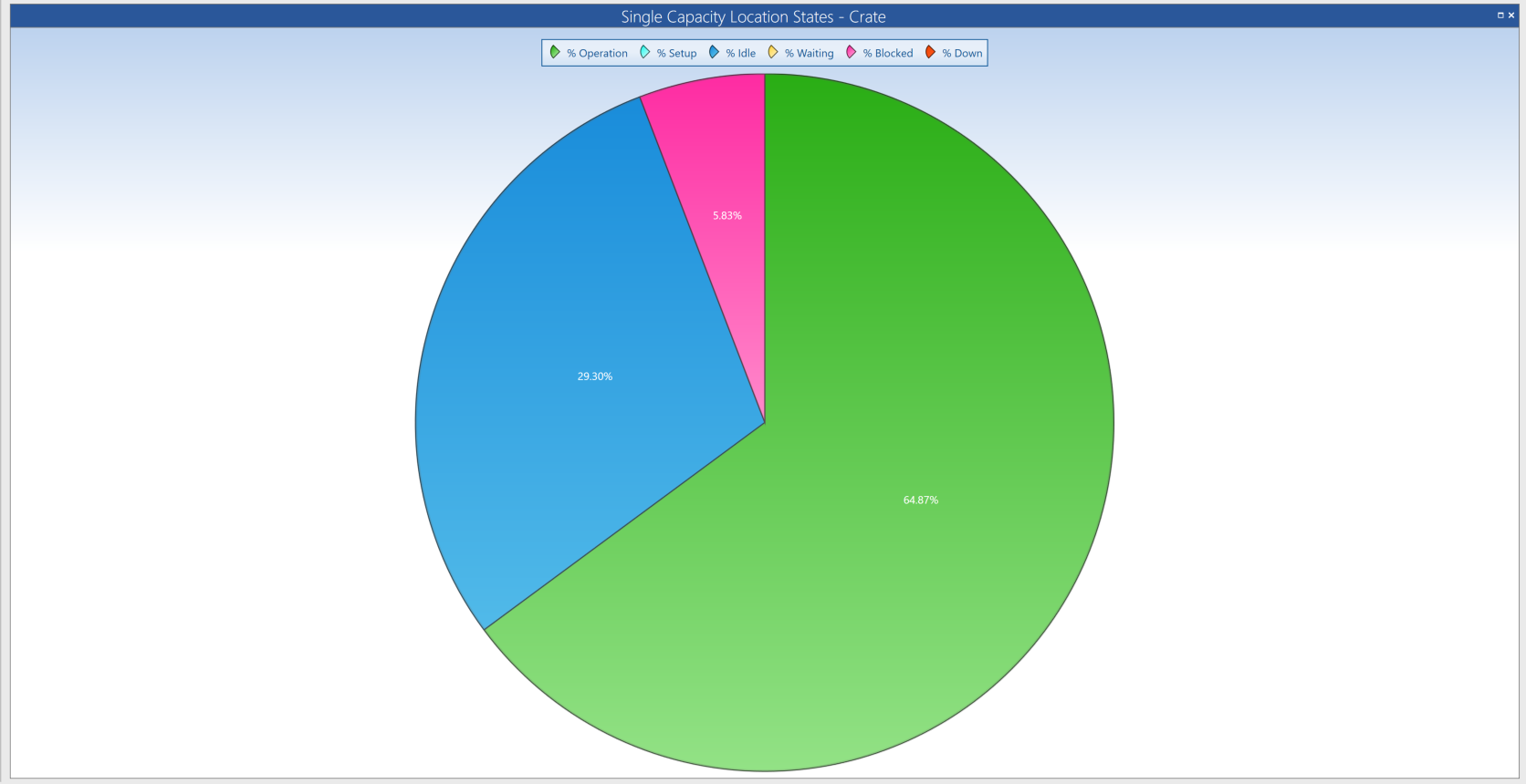
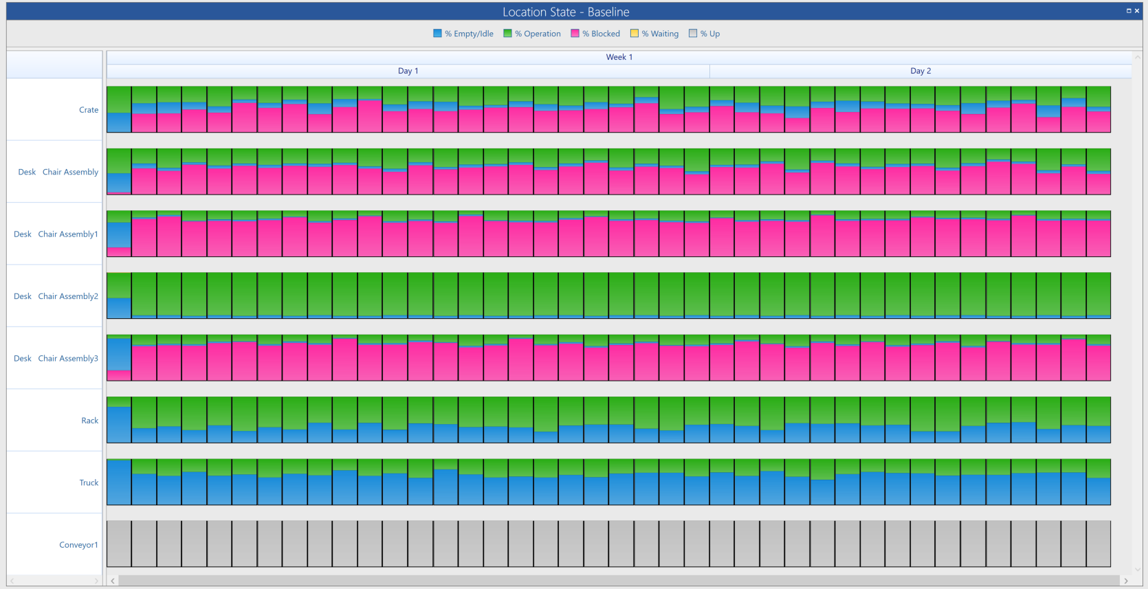
State tables and charts give percentage values for how much time an Entity, Location, or Resource spent in each state. Entities, Locations, and Resources each have a different collection of states that are observed. For more information on which actions are included in each state, see Output Viewer Help Guide.
State tables display numerical percentages to convey state information. State column charts use bar graphs to visually display information on a single state. The charts in the State section allow you to view a representation of all state percentages at once. Use the Output Viewer Filter to change what information displays in a state table or chart.
Costs
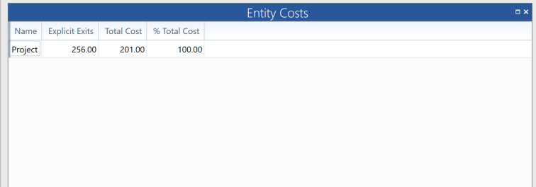
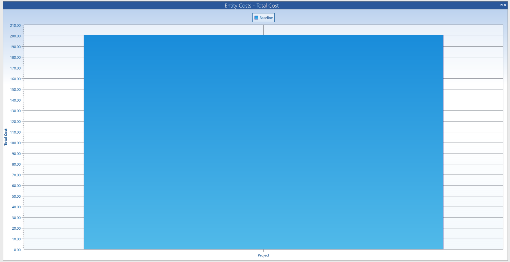
Cost tables and charts display cost information about Locations, Entities, and Resources, including total costs, operation costs, and usage costs. Cost tables display numbers to convey cost information. Cost charts use bar graphs to visually display cost information of a single category. Use the Output Viewer Filter to change what information display in a cost table or chart.
Time Series
The Time Series section includes charts that demonstrate time-related information.
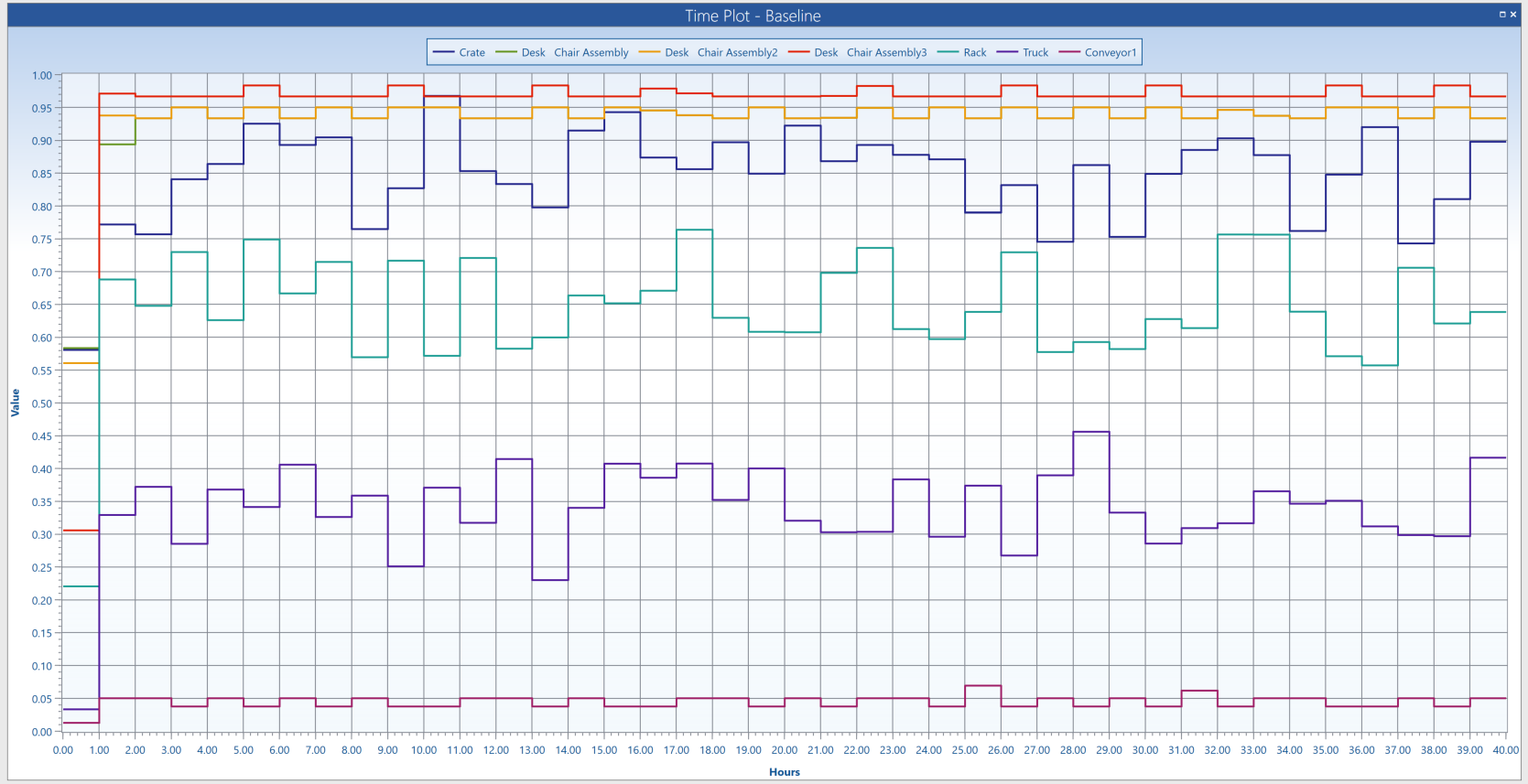
The Time Plot chart uses a line graph to demonstrate different information types over time such as contents, duration, and Variable history.
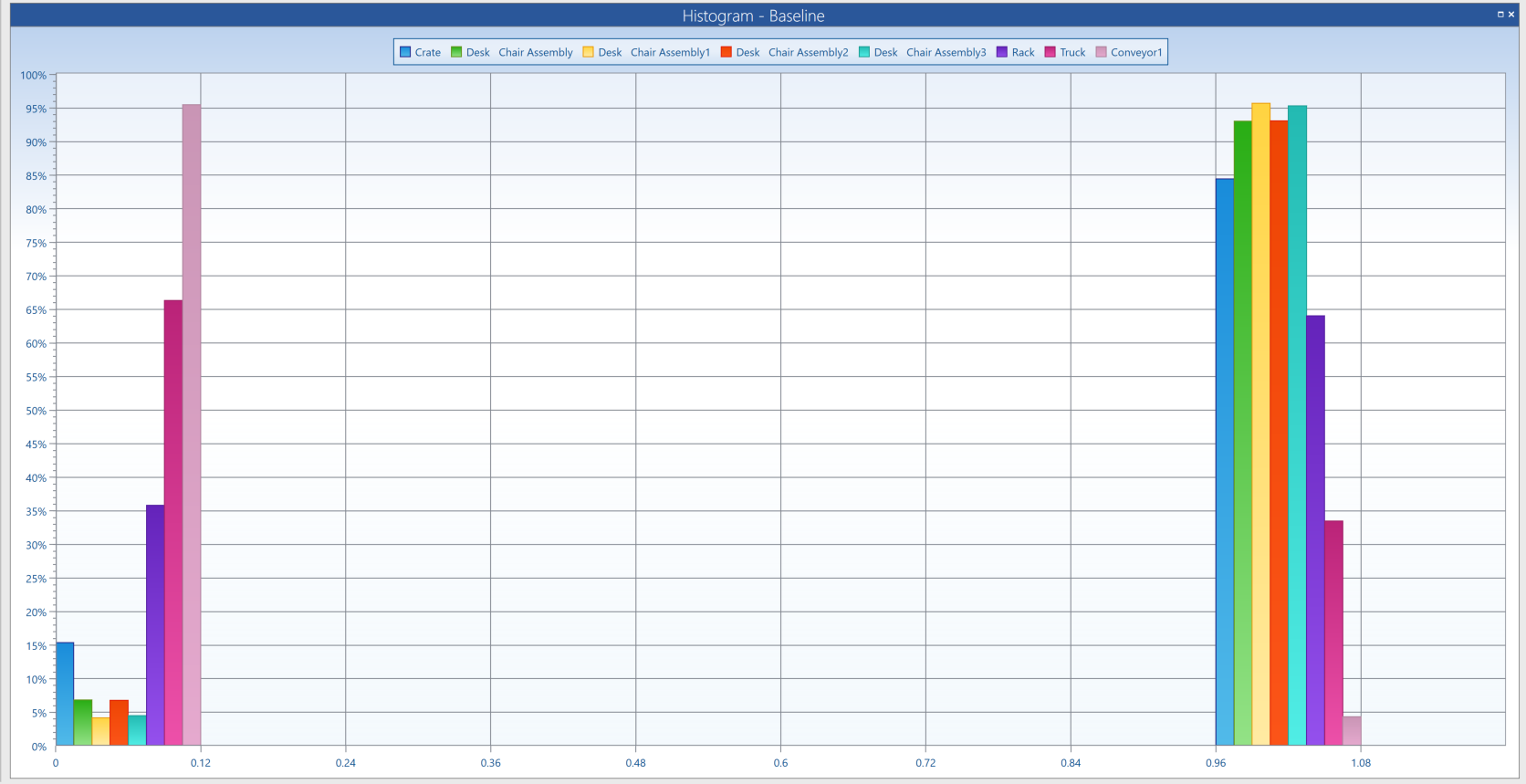
The Histogram chart displays the percentage of time that data fell within a particular value range.
The Time Series section also includes charts with previously discussed information on a time related basis, such as utilization and state.
For more in-depth information about navigating the Output Viewer, or how to interpret table or chart information, select the Help icon or visit the Output Viewer Help Guide.